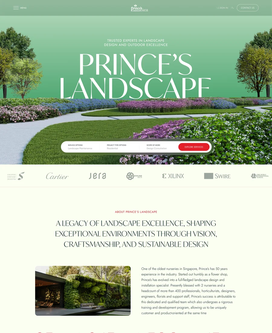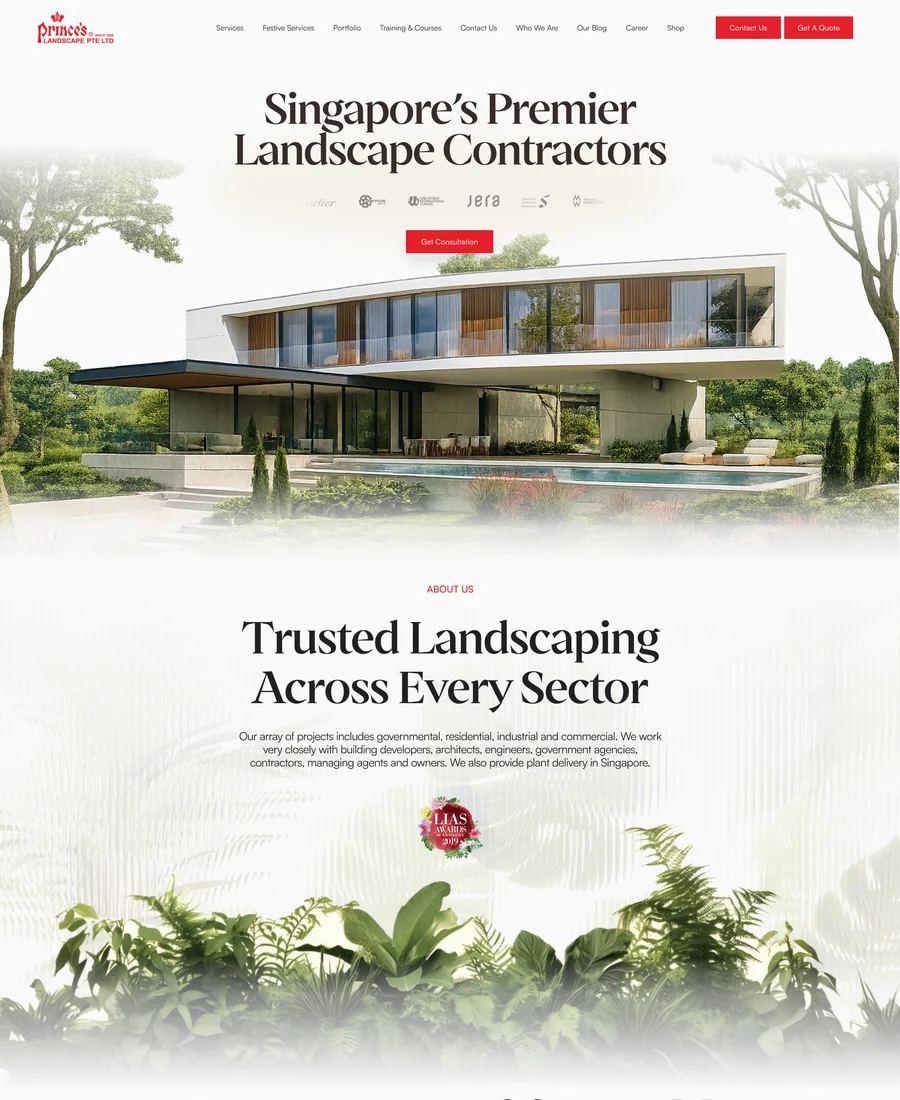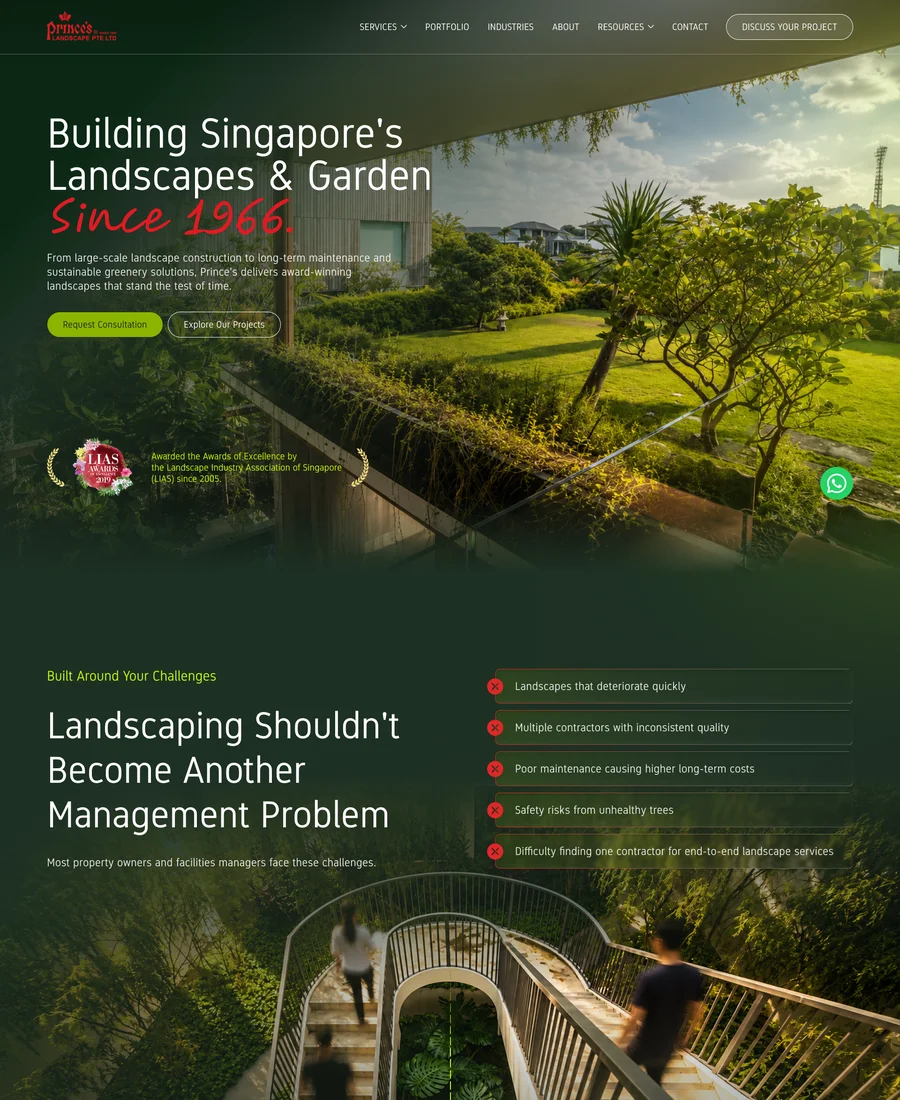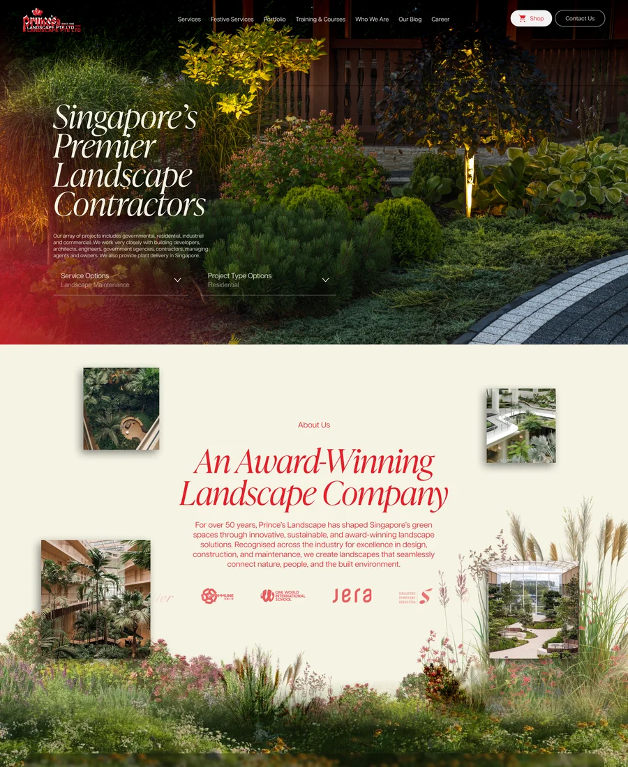
The initial design concepts for the Prince's Landscape digital experience, each presented as a complete homepage exploration.
Eight distinct creative directions for Prince's Landscape. Every concept is presented exactly as a guest would meet it: the entire page, top to bottom, with the thinking behind it.
Each preview glides on its own, or take the scroll yourself. Open any concept in full view for a closer look.
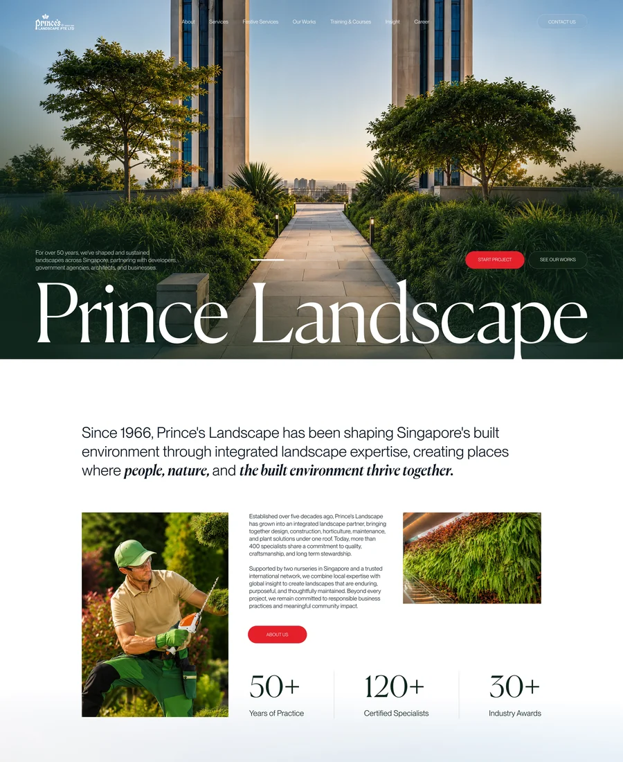
Deep botanical green, editorial serif type and generous calm. Sixty years of heritage lead the story, followed by proof, partners and services, positioning Prince's as a premium landscape partner rather than a contractor. The most stately and reassuring direction.
The page opens with legacy and scale, earns trust through partners and recognition, then explains services and the end-to-end process before closing with inspiration for the visitor's own space.

Bright, painterly and garden-fresh. A soft botanical canvas carries the legacy statement, award benchmarks and a full solutions grid, keeping the craft of gardens at the centre of every section. The most naturally beautiful and approachable direction.
Beauty first, then substance: the legacy statement and numbers build stature, the solutions grid and structured method show capability, and signature public projects close the case.

Clean, modern and tool-driven. Services, portfolio and process stay crisp and scannable, and the centrepiece is an interactive configurator where visitors assemble their ideal landscape before enquiring. The most product-minded and conversion-focused direction.
Credibility up front, services and delivery explained plainly, then the configurator turns interest into a specified enquiry that the closing form captures.

A dark, immersive journey built around one idea: the garden path. Services unfold along a winding trail through the page, reframing landscaping from a management problem into a guided, long-term partnership. The most conceptual and story-driven direction.
It opens on the client's pain, answers with performance, then walks the visitor down a winding path of solutions before landing on city-scale impact, awards and voices.

Romantic serif typography, crimson accents and photography in full bloom. Two decades of LIAS awards become the spine of the page, with the enquiry journey placed early and industry stories giving the brand an editorial voice. The most decorated direction.
Awards lead and return throughout: the enquiry form arrives early for intent, five decades of numbers and festival recognition build the middle, and green-industry stories close.

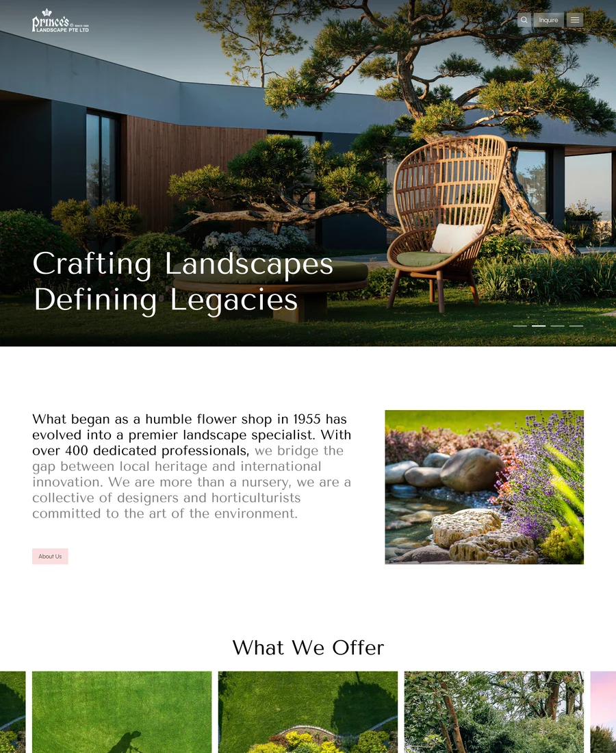
Soft neutrals, restraint and story. From a humble flower shop in 1955 to a collective of designers and horticulturists, the narrative unfolds in four numbered movements with work, voices and knowledge in support. The calmest and most understated direction.
A told-story structure: origin first, the offer and four-step method at the centre, then proof through work, testimonials, questions answered and ongoing knowledge.

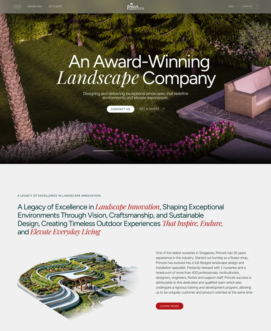
Refined editorial luxury with italic accents and gallery pacing. Awards and recognition frame the studio's thinking, portfolio pieces breathe like exhibits, and testimonials with real faces make the promise personal. The most design-studio direction of the eight.
Recognition opens, the integrated solutions and flagship portfolio carry the middle, and the page resolves through human voices into a direct collaboration form.

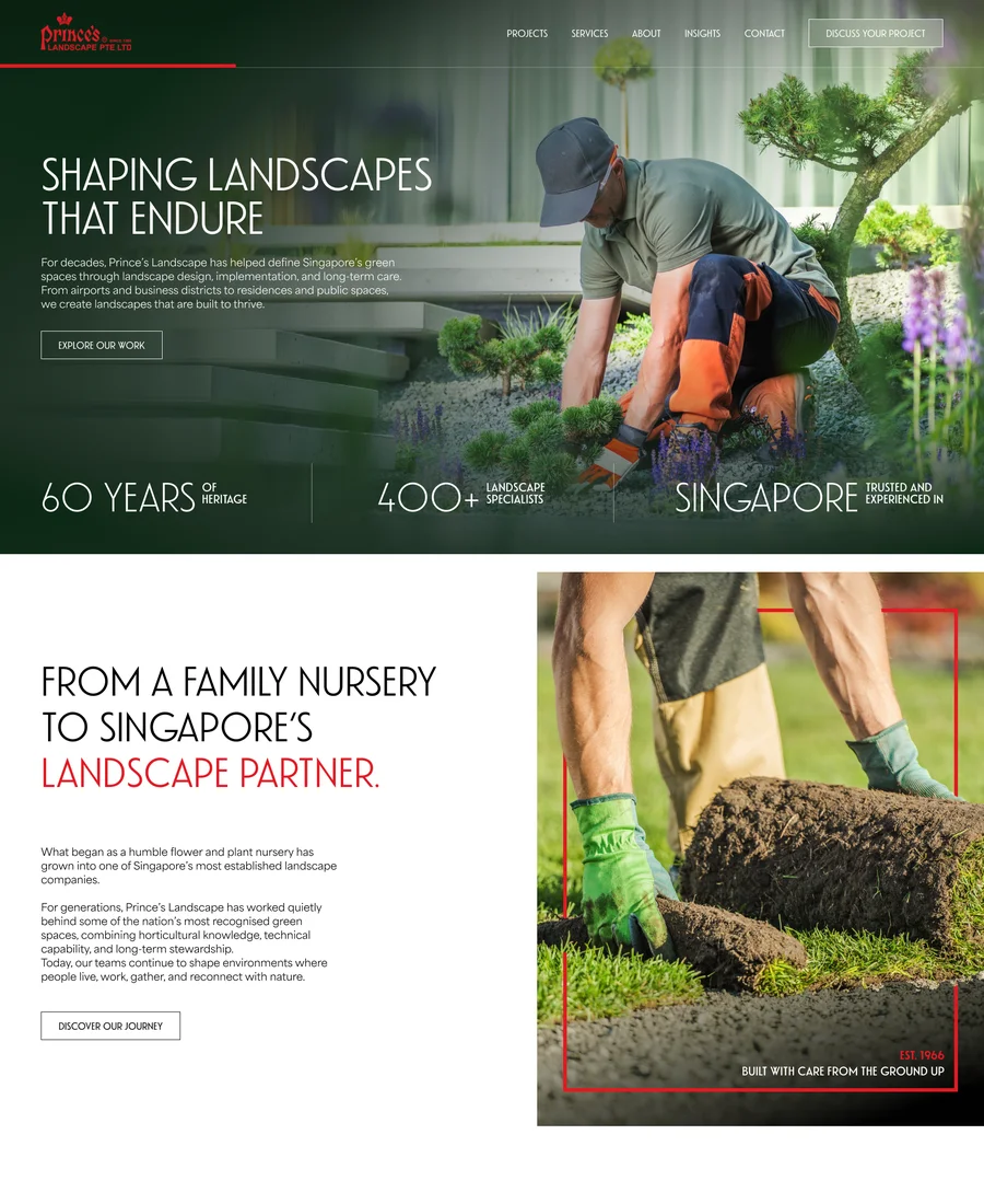
Confident red and condensed type over dark photography. The family-nursery story becomes a badge of endurance, with projects experienced by millions and a proud retro wordmark anchoring the brand. The boldest and most unapologetically Singaporean direction.
Strength leads: years, scale and story up front, landmark projects as proof, then expertise and process, ending on a partnership invitation under the heritage mark.

Tell us which concept resonates, or which blend of concepts, and we'll evolve it into the complete experience: inner pages, motion language and build. A simple reply on WhatsApp with a concept number is all it takes.